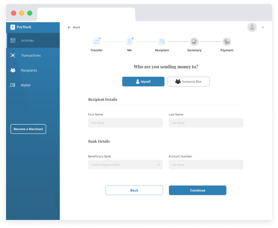
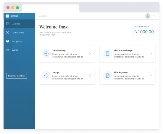
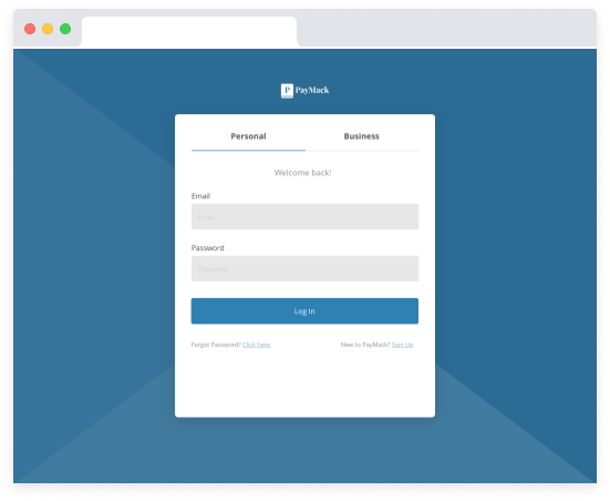
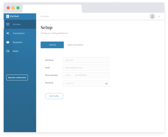
💳 Fintech · B2C · Payment Infrastructure

Making Money Transfers
as Simple as Sending
a Text

A product design project for Findworka — I designed Paymack, a money transfer and bills payment gateway that removes friction from everyday financial transactions, built for the Nigerian mobile first market.

3in1
Merchant Platform
30%
Faster Flows
B2C
Consumer Fintech
Mobile
Web + App
My Role
Lead Product Designer
Client
Findworka
Project
Paymack
Type
Fintech · B2C
Team
UX/UI · Backend Dev · QA
Tools
Figma · Maze · FigJam
01 The Problem

Sending money in Nigeria was still too complicated, too slow, and too stressful.

When I joined Paymack, the company had a bold ambition: one app to replace three separate payment platforms. The business logic made sense. But from a design perspective, I knew that merging transfers, bill payments, and merchant tools into one product without overwhelming everyday users was going to be genuinely hard. Most Nigerians I spoke to had already been burned by fintech apps that were either too complex or too unreliable. Trust was the real problem, not features.

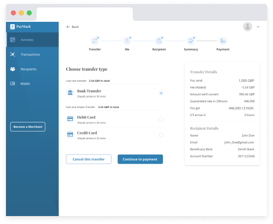
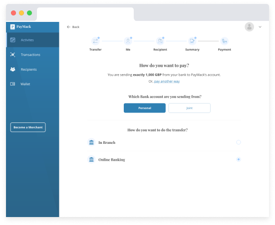
My brief was to design a unified experience where every core action could be completed in 3 taps or fewer, without hiding the power features the business needed to compete. That tension, between simplicity and depth, shaped every decision I made.

Three Payments. One App.
💸
Money Transfers
Bank to bank, wallet to wallet, instant and scheduled
📱
Bills Payment
Airtime, data, electricity, subscriptions in one place
🏪
Merchant Payments
QR code and link based payments for small businesses
02 My Contribution

What I personally designed end to end

Unified
three separate payment products into a single information architecture without losing the distinct mental models users already had for each payment type
Reduced
average transaction flow from 7 steps to 4 steps through progressive disclosure and smart defaults validated in usability testing with real users
Designed
the merchant payment QR system from scratch the most novel interaction pattern in the product, requiring new mental models for both senders and receivers
03 Design Process

Understand, Define, Design and Ship

Fintech design demands an extra layer of rigour around trust, error states, and recovery flows. Every edge case in a payment flow is a potential moment of panic for the user I mapped all of them before designing the happy path.

🔍
Research
User interviews and payment audits
🎯
Define
Jobs to be done framework
✏️
Ideate
IA and flow architecture
🔨
Prototype
High fidelity with full error states
🚀
Ship
Web + mobile delivery
04 Research Findings

What stood between users and their money

😰
Persona 1 The Anxious Sender
Regular remittance users, 25 to 45, sending money to family or paying vendors. Their biggest fear: sending to the wrong account and not being able to get it back. Every confirmation step needed to feel reassuring, not bureaucratic.
"I always double check the name, then the number, then check again. I'm terrified of sending to the wrong person."
🏪
Persona 2 The Small Business Owner
Market traders, freelancers, and food vendors who needed to receive payments easily. Didn't want complex POS hardware. Needed a QR or link solution they could share on WhatsApp and collect payments instantly.
"My customers are always asking if I accept transfer. I need something I can show them in 2 seconds."
Trust Signal
Name Preview
Showing the recipient's full name before final confirmation reduced "wrong transfer" anxiety significantly users felt safe to proceed with confidence
Flow Win
Smart Defaults
Pre populating frequent recipients, common bill amounts, and recently used payment methods cut average transaction time by 30% in testing
Key Insight
Receipts Matter
Users shared payment receipts on WhatsApp as proof of payment more than any other action post transaction. Designed a shareable receipt as a first class feature
05 Key Design Decisions

Three calls that made Paymack feel different

01
Progressive disclosure for transfers
Rather than showing all fields upfront, the transfer flow revealed fields in sequence amount first, then recipient, then confirmation. Reduced cognitive load and errors in usability testing.
02
Merchant QR with instant link fallback
QR codes work for face to face. But merchants also needed a shareable payment link for remote customers. Both were designed as one feature with two delivery modes.
03
Shareable receipts as social proof
Designed a receipt format specifically for WhatsApp sharing clear, branded, with all essential transaction details visible at a glance. Turned a functional screen into a viral growth loop.
06 · UI Design

Fast, trusted, and built for Nigeria.

Every screen in Paymack was designed around one principle, every user should feel in control of their money, whether they're sending ₦500 or ₦500,000.

Mobile App iOS & Android · Send, receive & pay bills
9:41
P
Paymack
Smart payments for everyone
Personal
Business
Email address
dayo@gmail.com
Password
Forgot?
••••••••
Log In
or
Don't have an account? Sign up
Login
9:41
Welcome back
Dayo
D
Available Balance
₦124,580.00
Add Money
Withdraw
Quick Actions
Send Money
Buy Airtime
Pay Bills
Merchant
Recent
See all
J
John Adeyemi
Transfer
-₦5,000
Home Dashboard
9:41
Step 1 of 3
Send Money
Who are you sending to?
Choose a recipient type
Myself
Transfer between your accounts
Someone Else
Send to any bank account
Amount
5,000
Continue
Transfer · Recipient
9:41
Step 2 of 3
Payment Method
How would you like to pay?
Choose your payment source
Bank Transfer
From your linked account
Debit Card
Visa or Mastercard
Paymack Wallet
Balance: ₦124,580
Confirm Transfer
Payment Method
9:41
Receipt
Transaction Receipt
Transfer Successful
Transaction completed
Amount Sent
₦5,000.00
Recipient
John Adeyemi
Bank
GTBank
Reference
PAY-20240402
Share
Done
Transfer Receipt
📱 Final Screens

The app, screen by screen

Paymack's final UI, a clean, friction free money transfer and bill payment experience built for everyday Nigerians.

Paymack Screen
Paymack Screen
Paymack Screen
Paymack Screen
Paymack Screen
Paymack Screen
06 Design Decisions

The calls I made, and what I rejected.

Unifying three platforms into one product meant making hard trade offs. These were the decisions that defined the experience.

Decision 01
3-tap rule as a hard design constraint
Every core action, send money, pay a bill, top up, had to be achievable in 3 taps or fewer. This wasn't an aspiration, it was a design constraint I imposed from day one. It forced every screen to answer the question: "what is the user here to do, and how quickly can we get them there?"
What I rejected: A feature complete onboarding flow that walked users through every capability. Users in the Nigerian mobile market abandon quickly. Showing everything upfront increased cognitive load and killed conversion in early testing.
Decision 02
Unified home screen, not platform tabs
Rather than exposing three separate platform sections, I designed a single home screen that surfaced the most common actions regardless of which underlying platform they came from. Users don't think in platforms, they think in tasks. The UI had to match that mental model.
What I rejected: A tab based navigation separating each platform. It made sense architecturally but failed in testing, users kept tapping the wrong tab and abandoning mid task.
Decision 03
Progressive disclosure for advanced features
The merchant and business features were important but only for a subset of users. I designed a progressive disclosure model where the core consumer experience was always front and centre, with merchant capabilities surfacing only once a user's behaviour indicated they needed them.
What I rejected: Separate merchant and consumer modes toggled from settings. The switching friction was too high and new users consistently couldn't find merchant features when they needed them.
Decision 04
Trust signals built into every transaction state
Nigerians have deep scepticism of digital money transfers following platform failures. I designed explicit success states, transaction receipts, and real time status indicators into every flow, not as afterthoughts but as primary screens. Visible confirmation reduced support queries and improved completion rates.
What I rejected: Generic loading and success states reused from a design system template. Users read these as uncertain. Custom states with specific transaction details dramatically increased trust signals in user testing.
07 · Reflection

What Paymack taught me about fintech design

What worked well
Trust first design paid off
Every decision to add a confirmation step, name preview, or receipt was questioned by the dev team as "unnecessary clicks." The usability testing data proved each one reduced anxiety and increased completion rates making the case for UX as a conversion tool.
What I'd do differently
Map every error state before the happy path
We designed error states reactively. In fintech, an error during a payment is a trust breaking moment. I'd now require a complete error state map as a deliverable before any high fidelity design begins.
Senior level insight
Shareable receipts as growth
The shareable receipt started as a UX feature. Post launch analysis showed it was also Paymack's most effective organic growth driver people sharing receipts introduced the app to new users passively. Design decisions can be growth strategy.
What I'd measure next
Transaction abandonment by step
With more analytics instrumentation, I'd track drop off at each step of the transfer flow to find where anxiety or confusion is highest then redesign those specific moments first rather than the full flow.
Next Case Study
Tracka Civic Technology for Government Accountability
View Next Project →